CBW
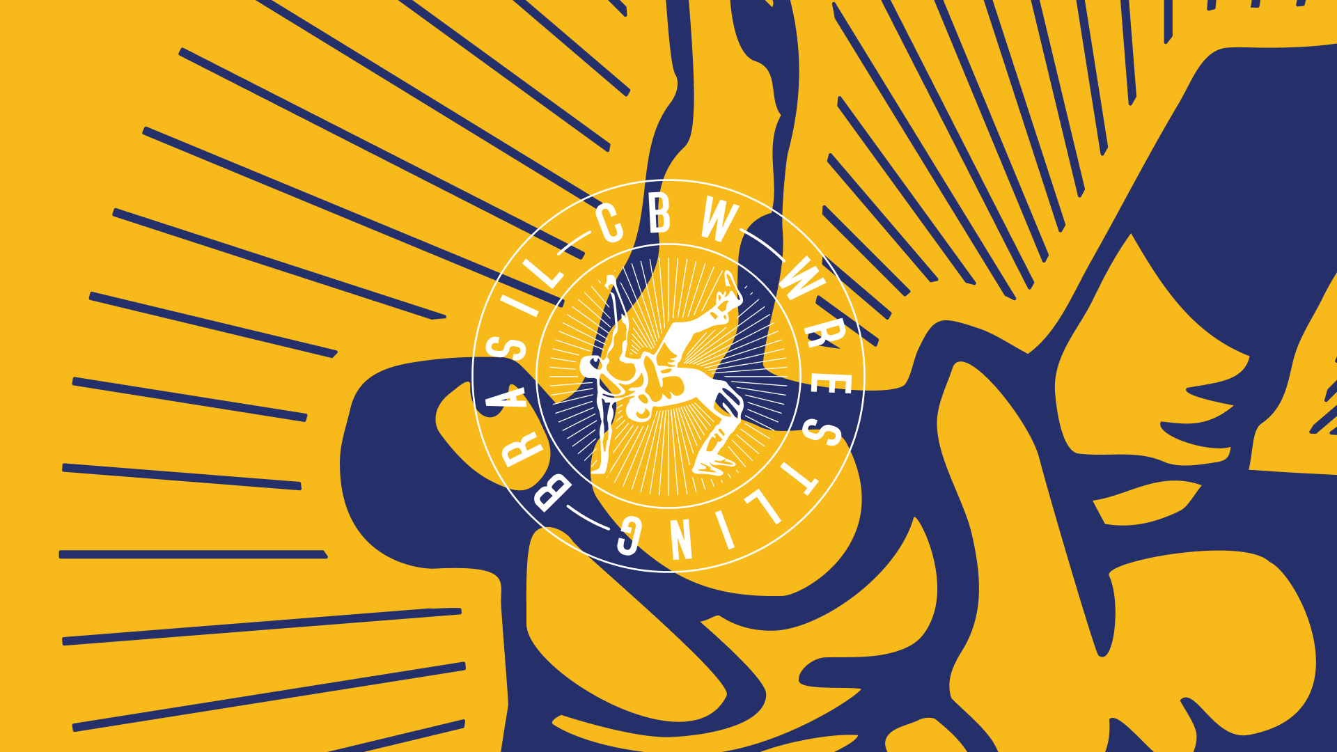
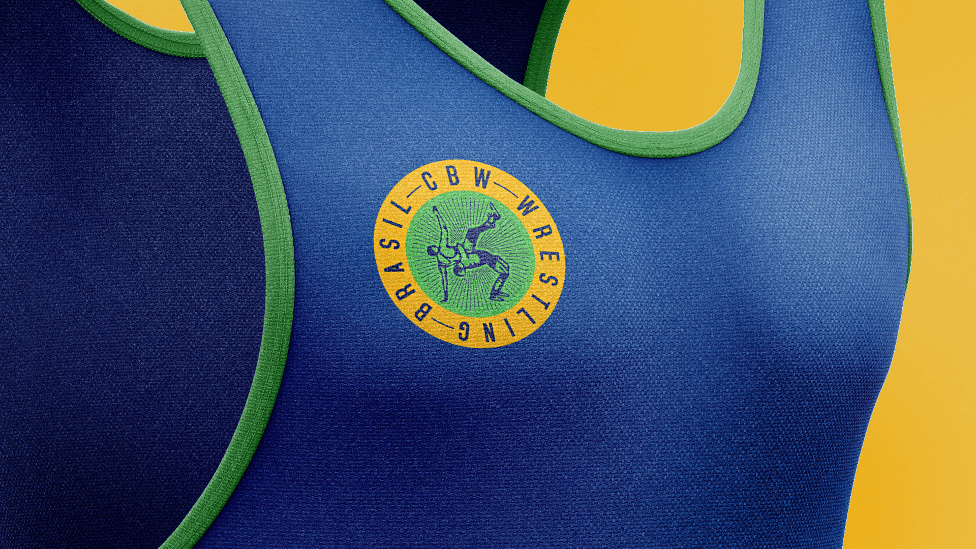
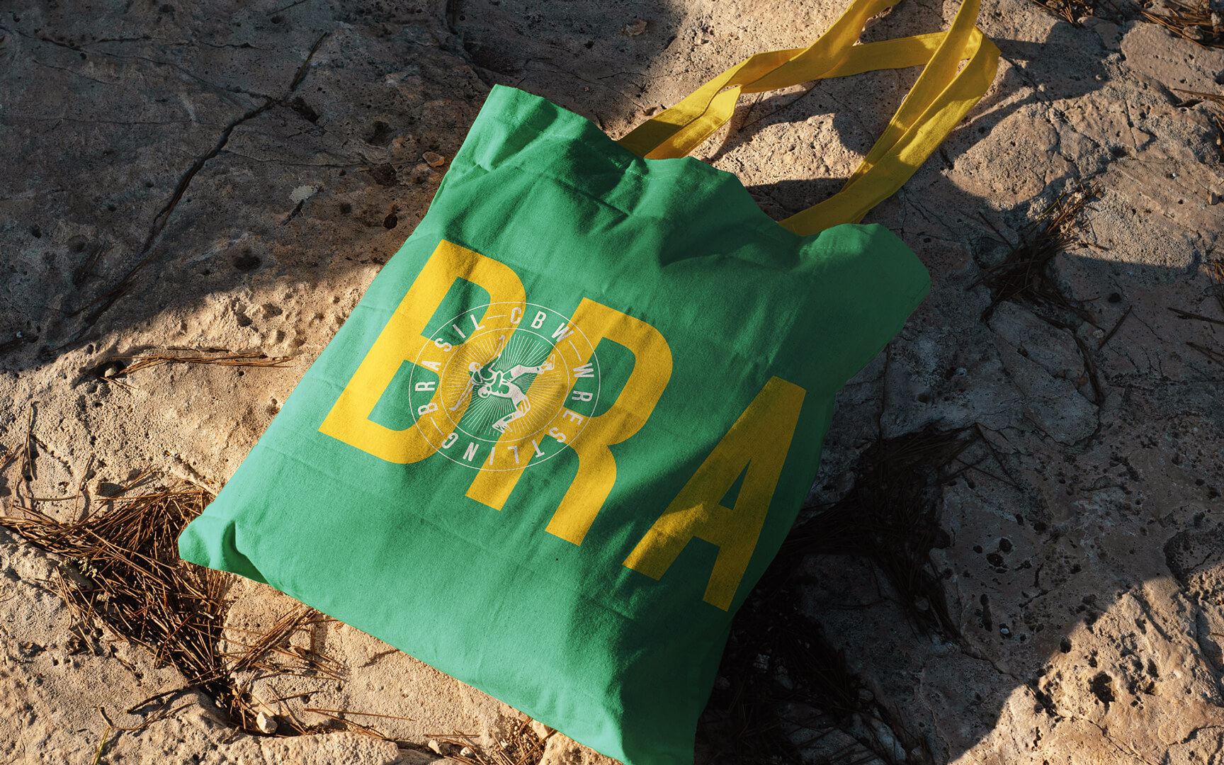
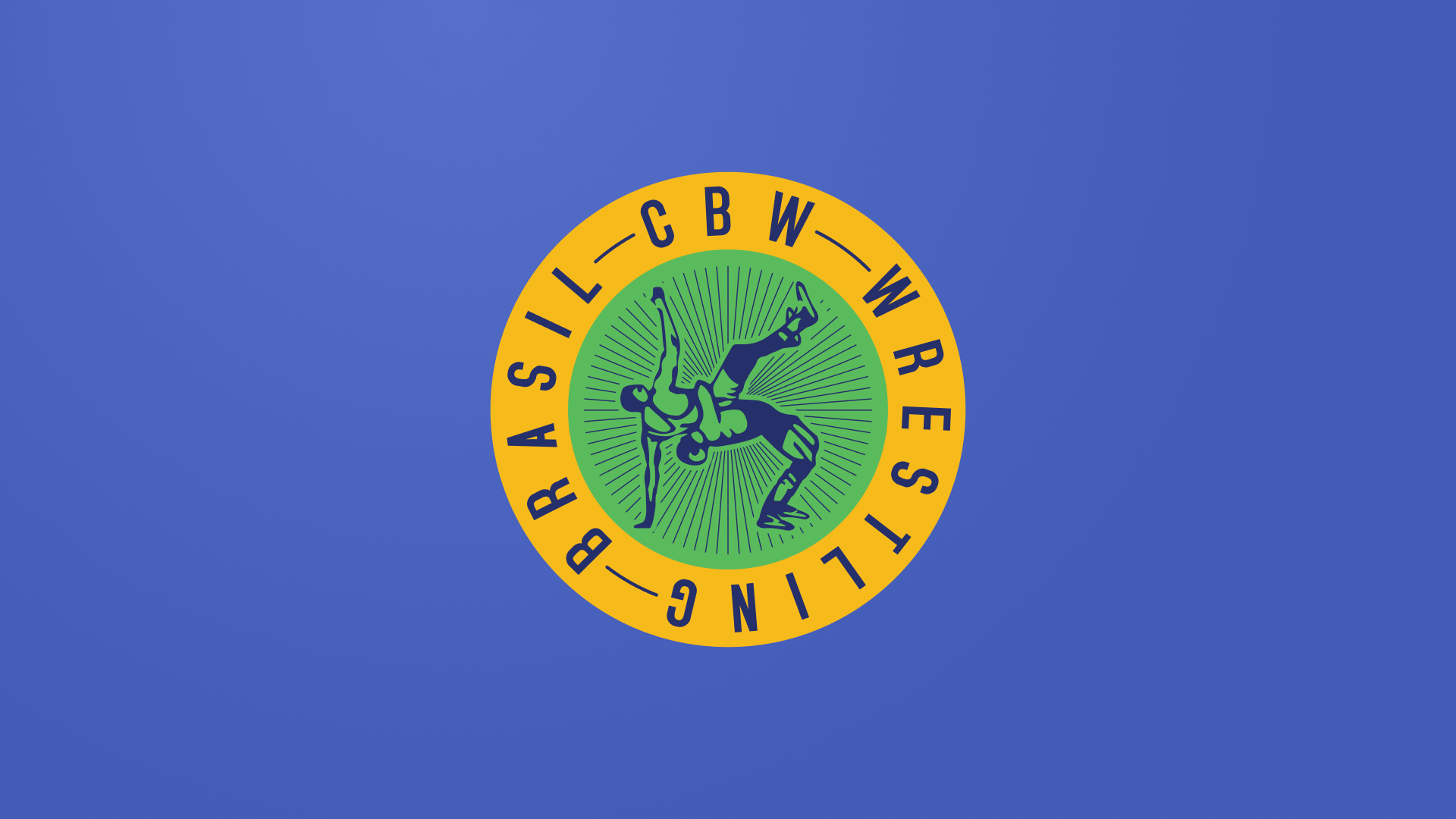
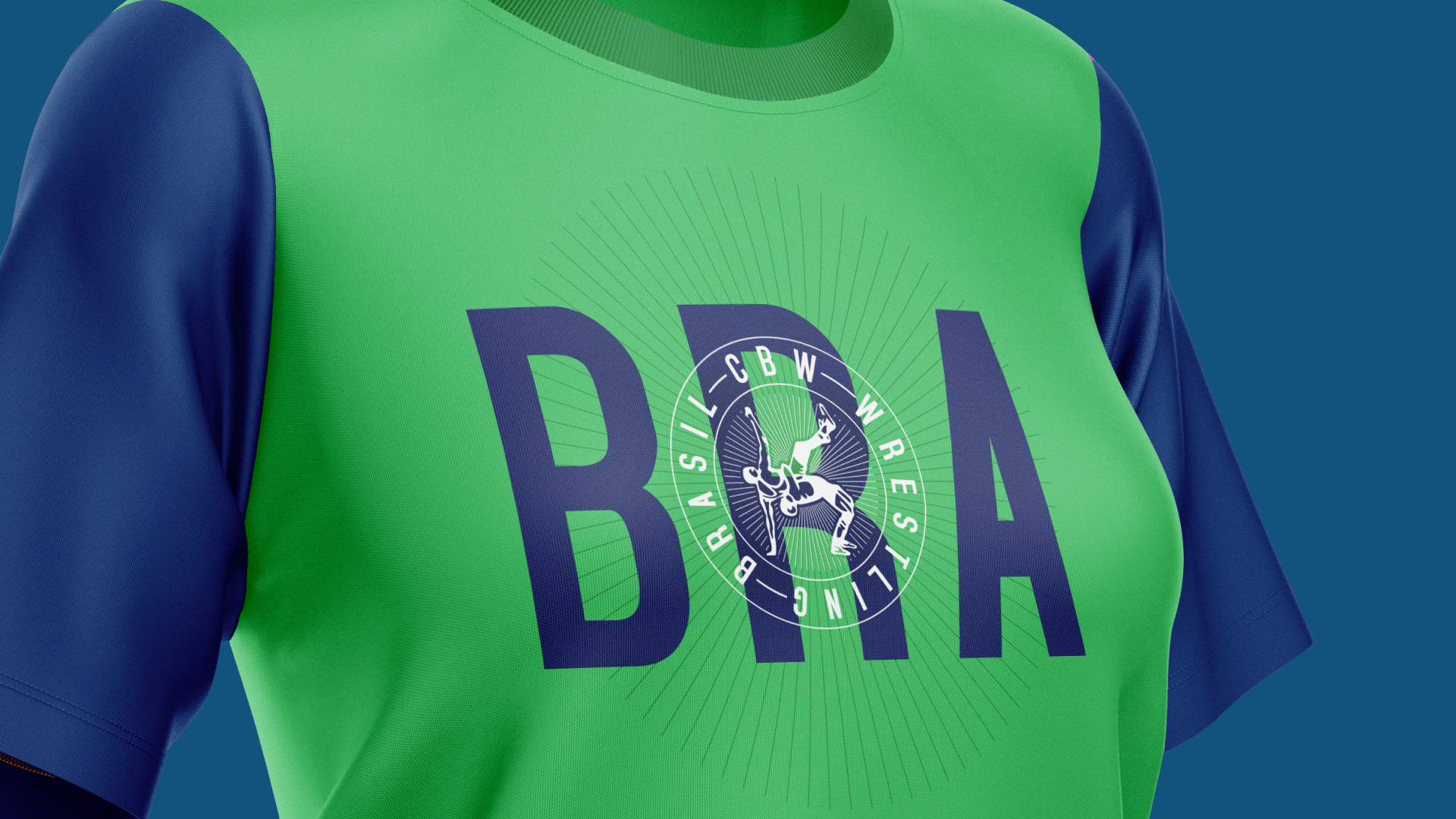
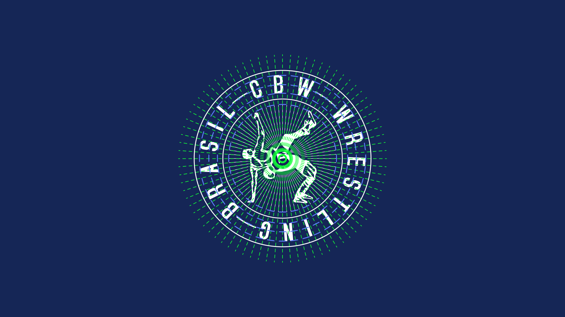
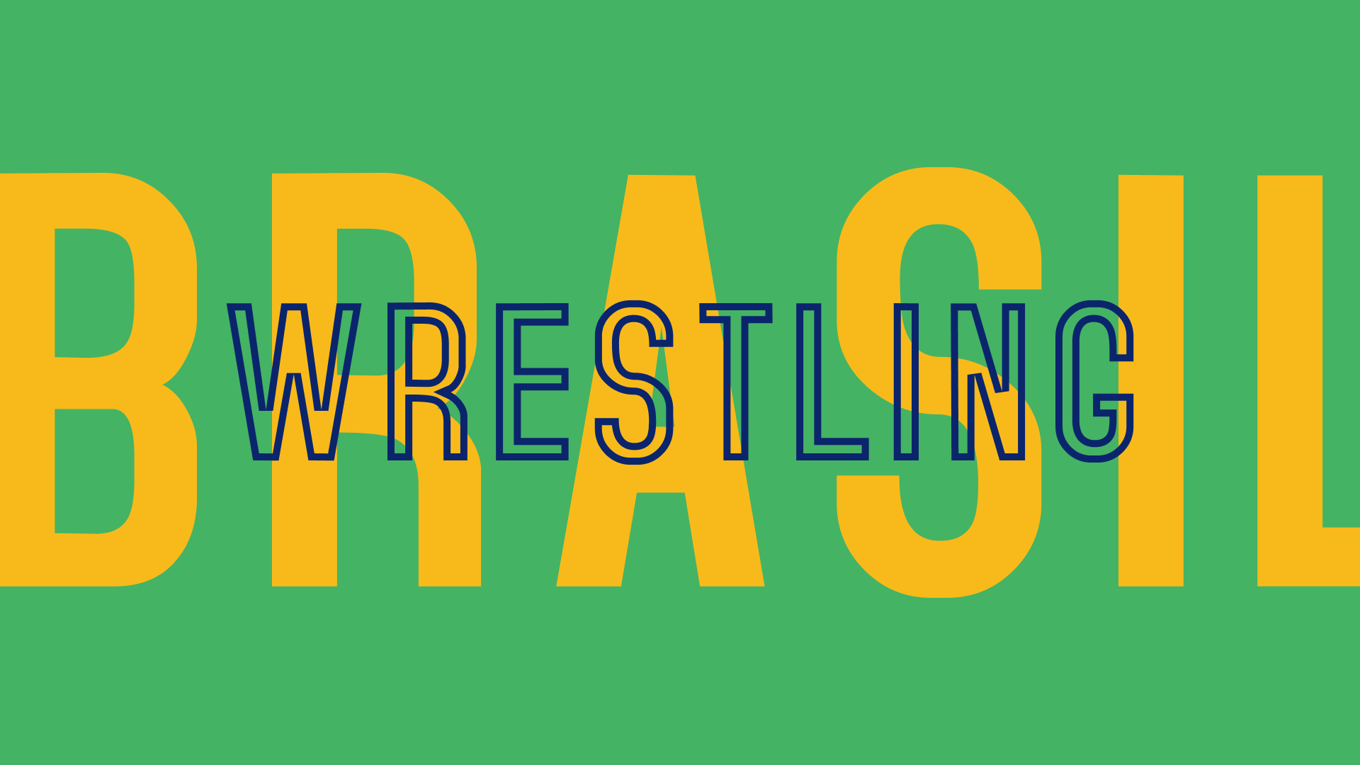
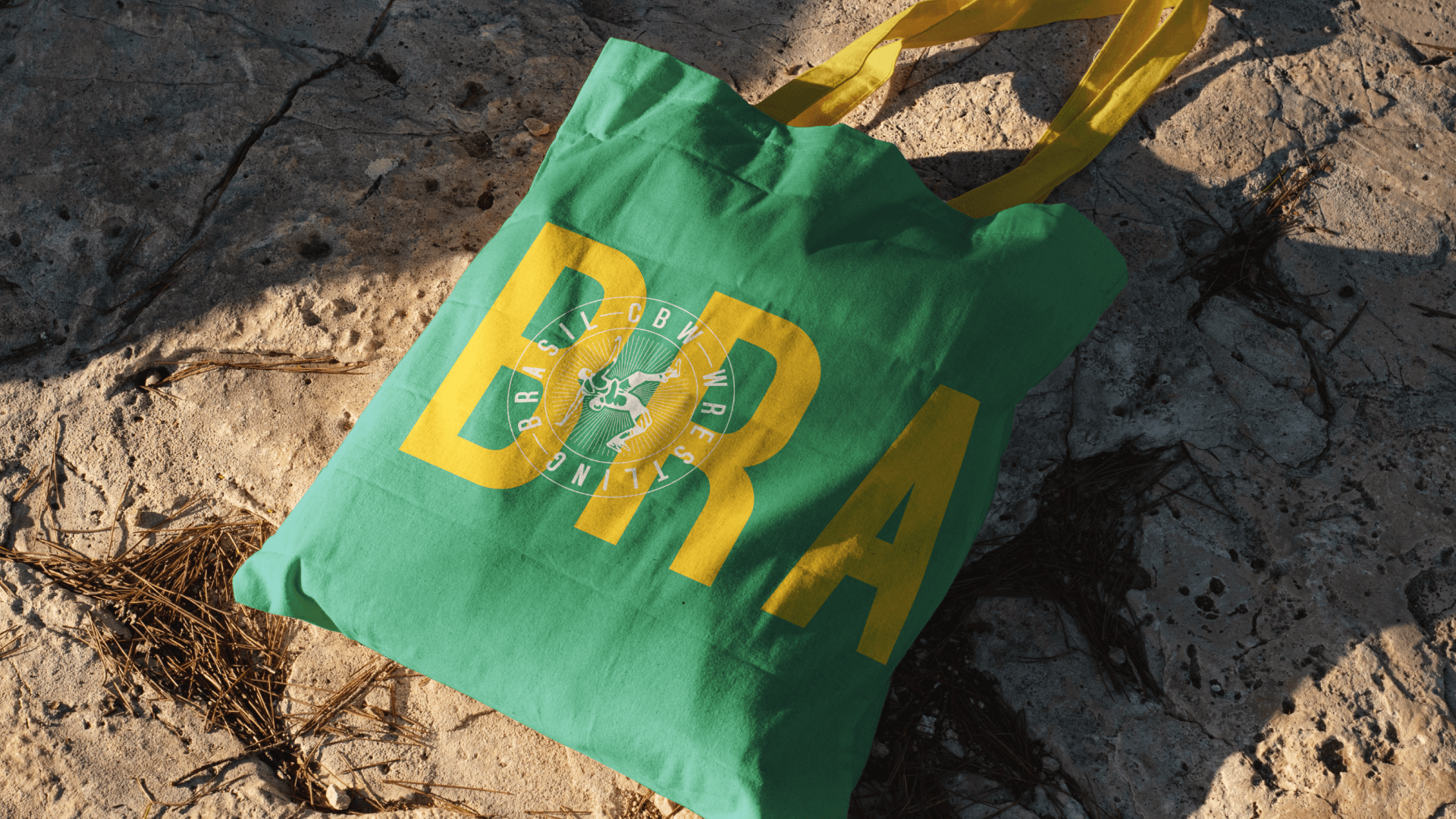
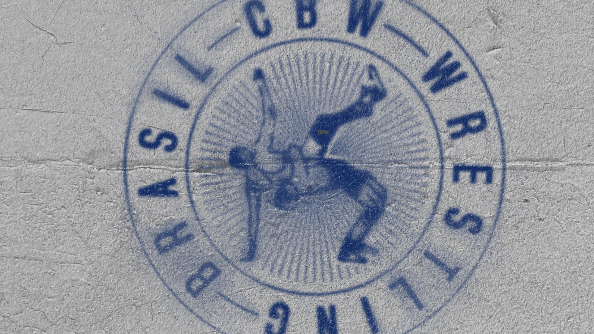
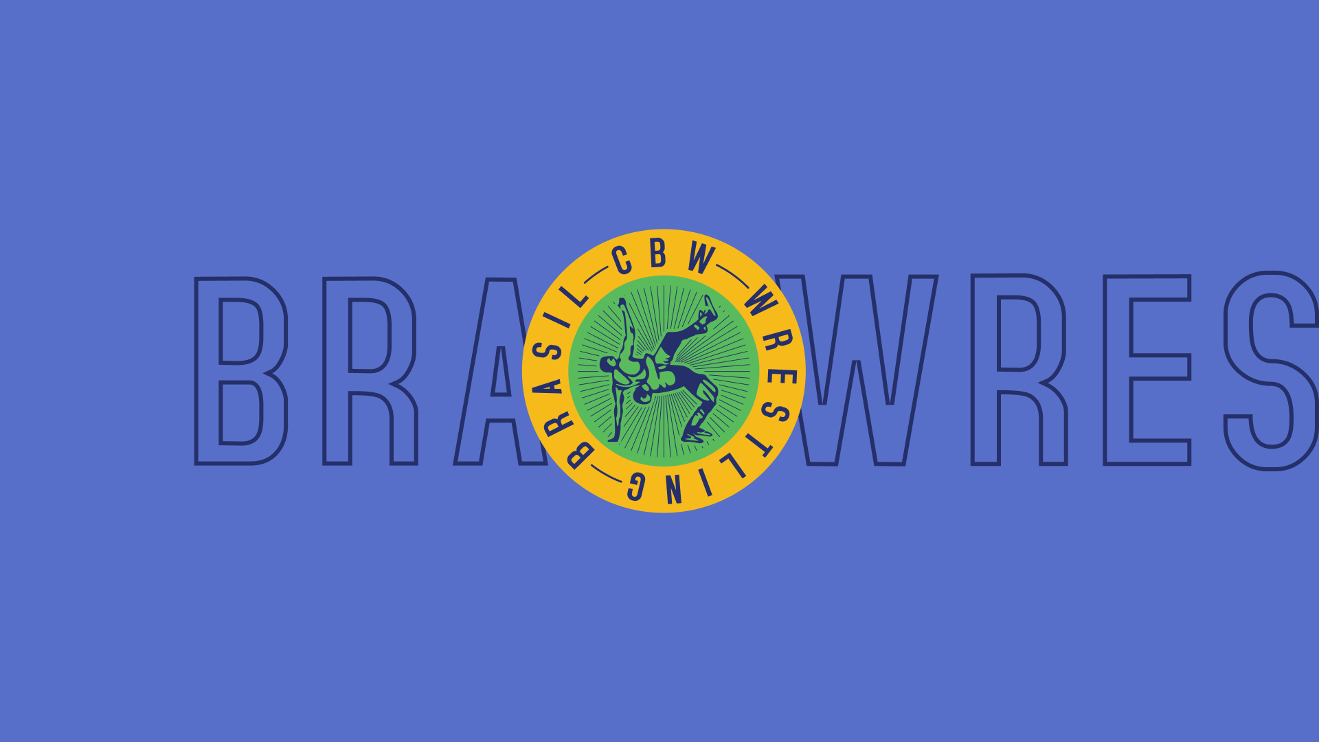
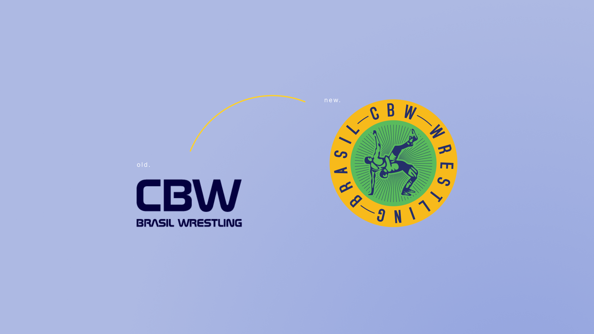
Rebranding. Criação de uma marca mais jovem, moderna e atrativa ao público, além da atualização de seu uso de forma mais coesa e inteligente para consolidação e construção da marca, iniciando mais um marco na história do esporte no país. Para o novo branding da CBW, foi aplicado o formato circular do tapete onde ocorrem as lutas, assim como os atletas aplicando o golpe “Suplex”, um movimento típico da modalidade. Complementando com a abreviação da Confederação (CBW), juntamente com o título WRESTLING BRASIL, para facilitar a ligação e reforçar o próprio nome do esporte para o público geral. As cores fazem alusão as cores do Brasil em tons mais fortes e modernos.
Rebranding. Design of a younger, more modern, and appealing brand, updating its use in a more cohesive and intelligent way to consolidate the brand, marking another milestone in the history of the sport in Brazil. For the new CBW branding, the circular shape of the mat where the fights take place was adopted, as well as the athletes applying the "Suplex" hold, a typical move of the sport. Complementing this with the abbreviation of the Confederation (CBW), along with the title WRESTLING BRASIL, to facilitate the connection and reinforce the name of the sport to the general public. The colors allude to the colors of Brazil in stronger and updated tones.