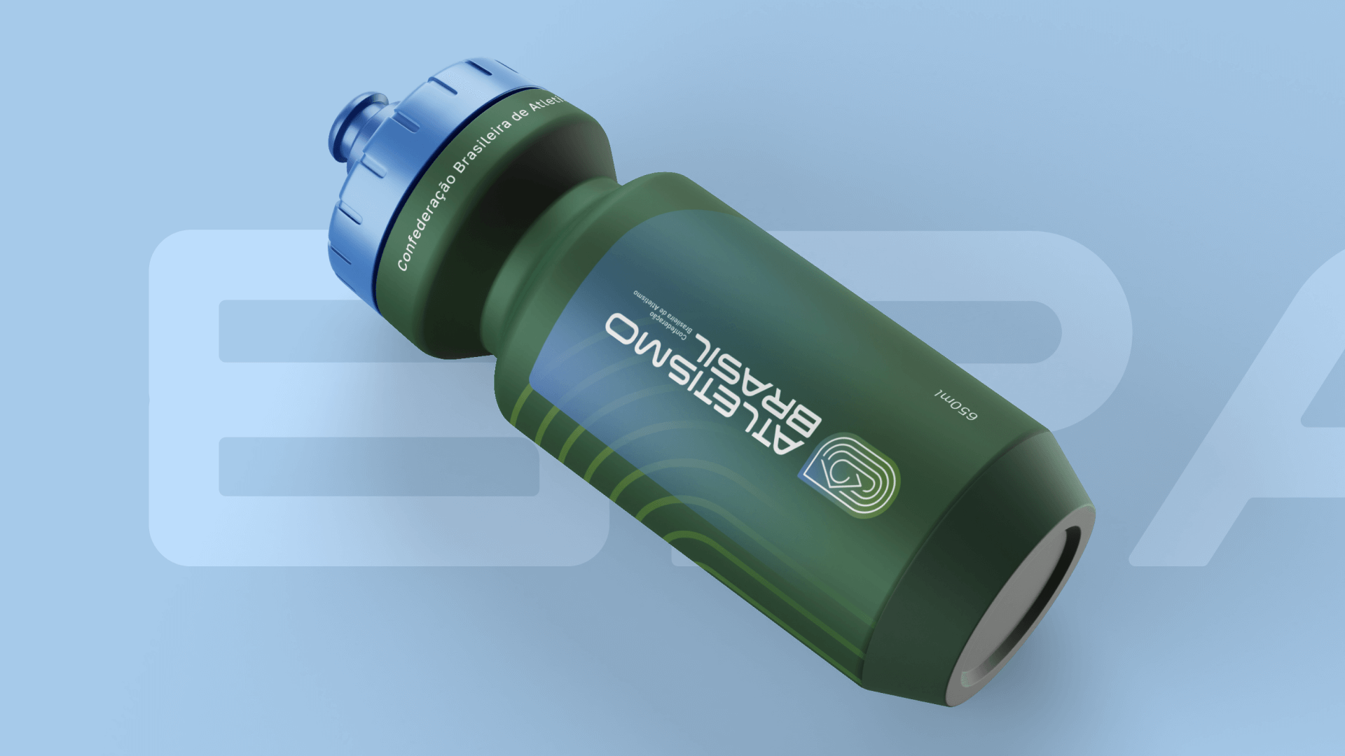
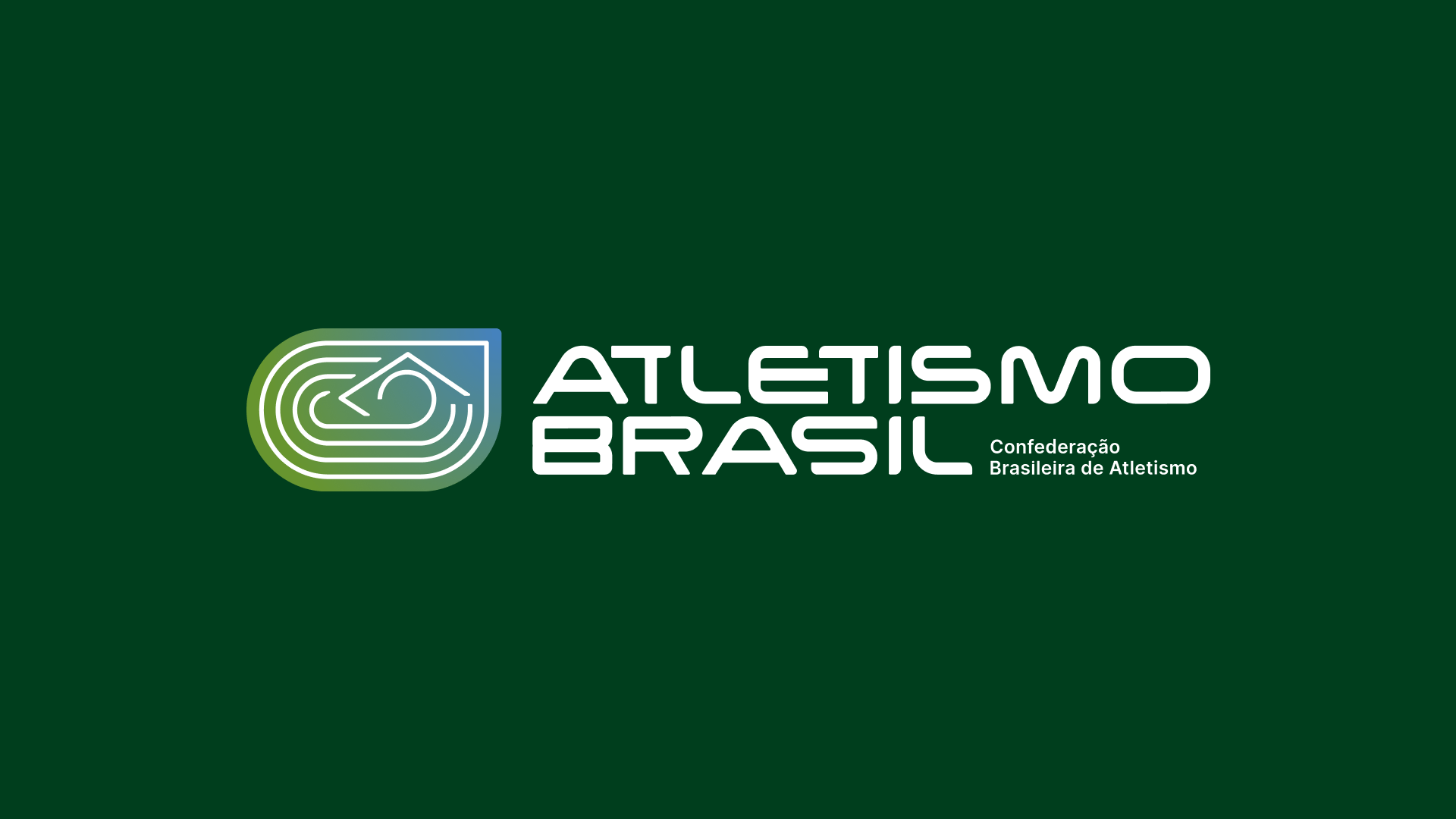
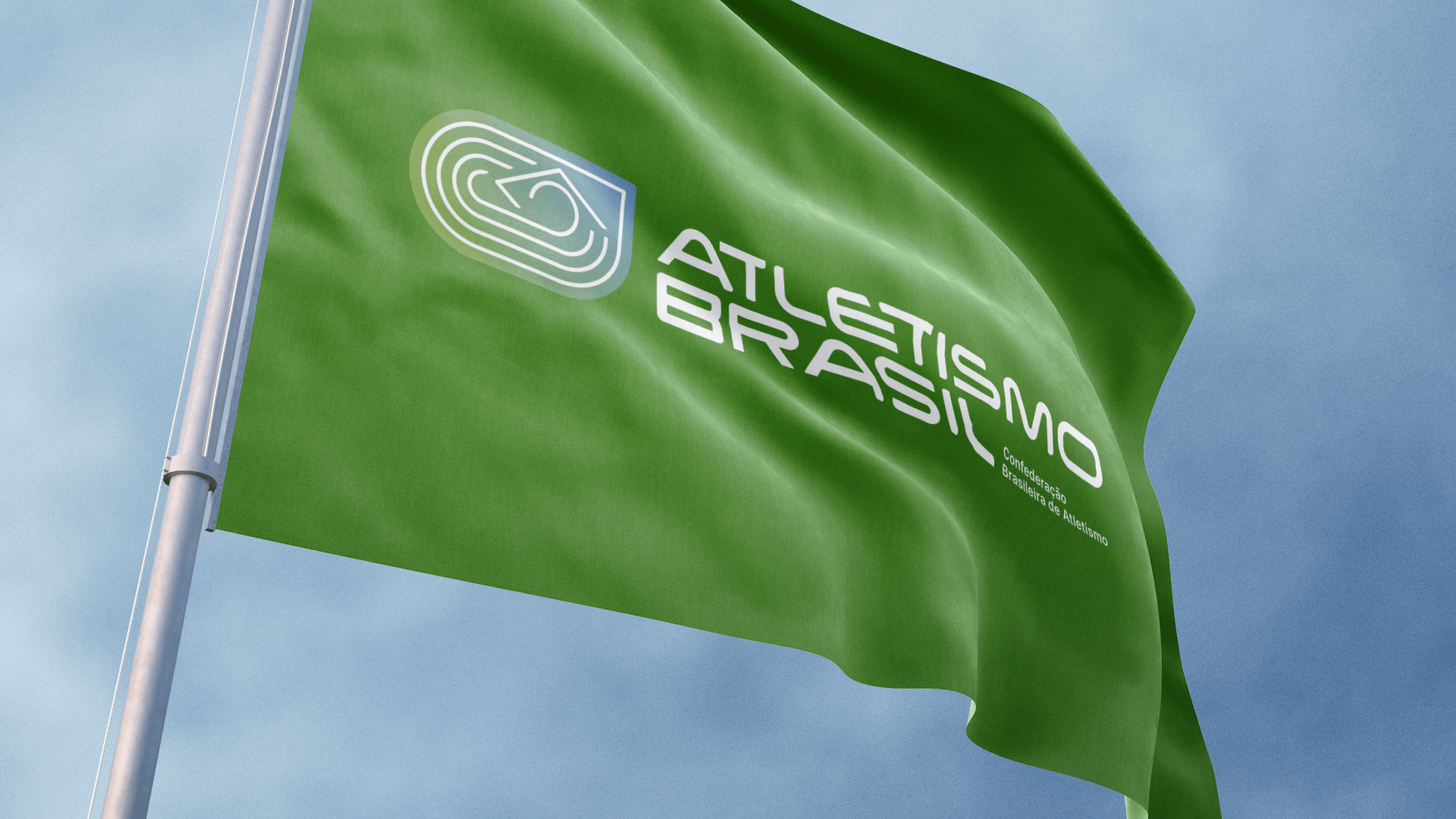
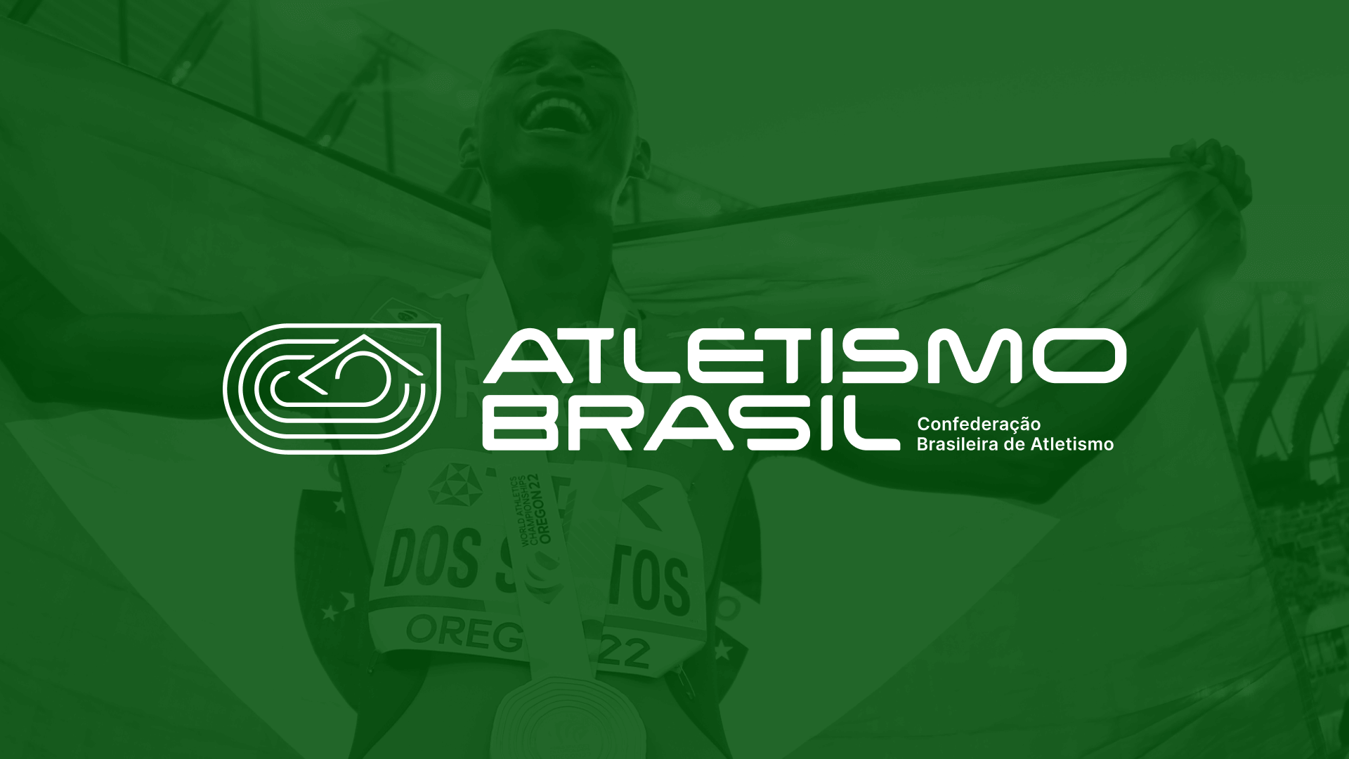
ATLETISMO BRASIL
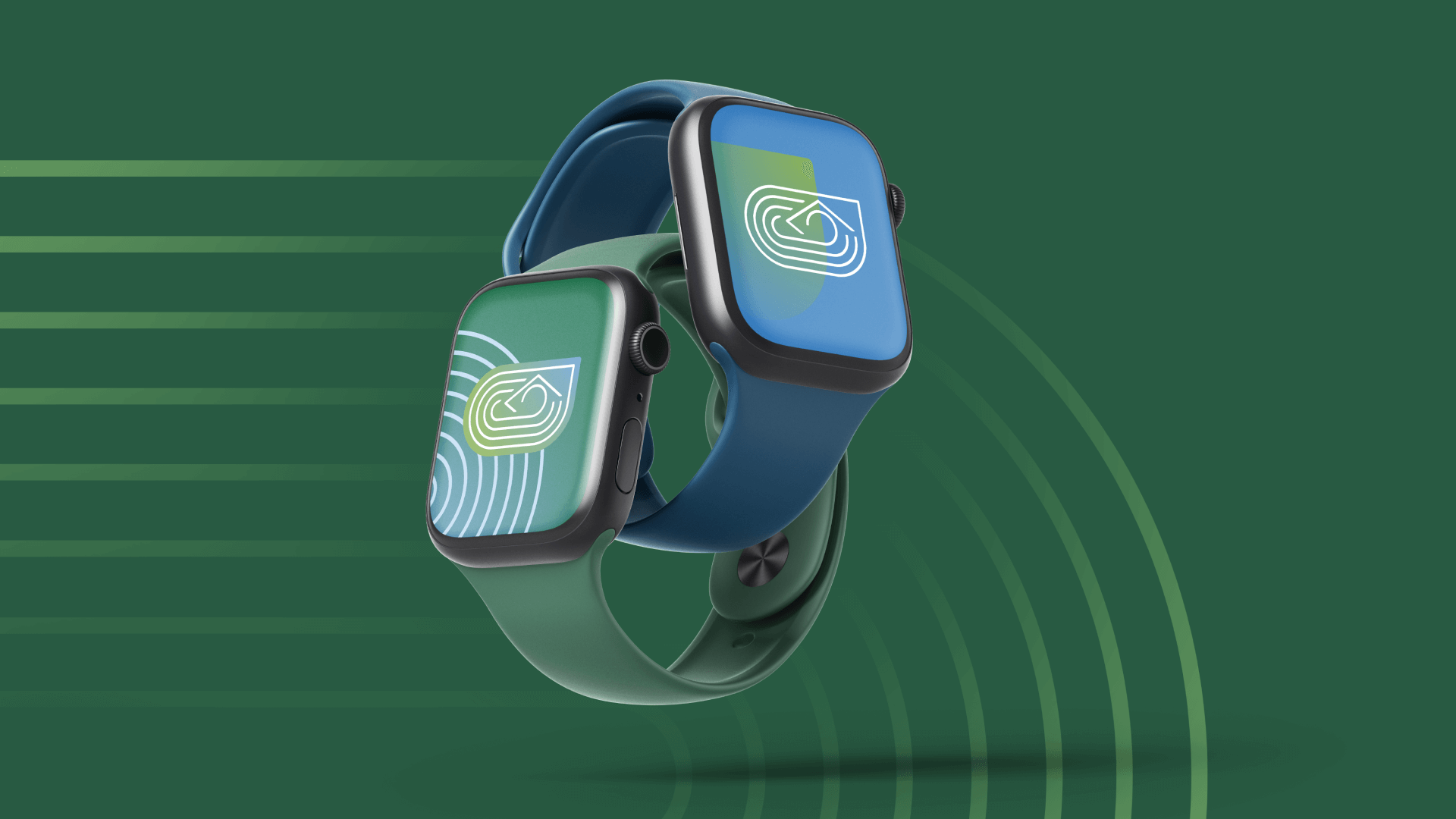
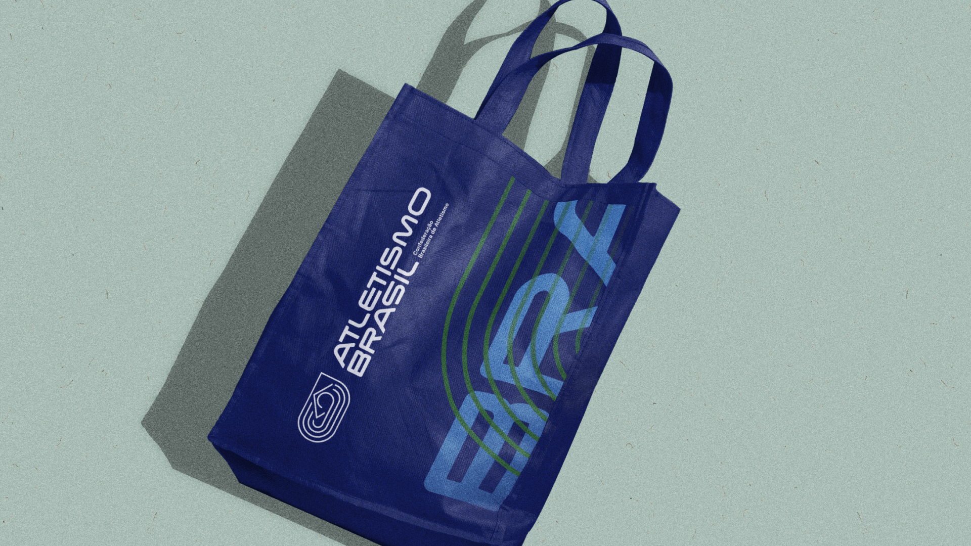
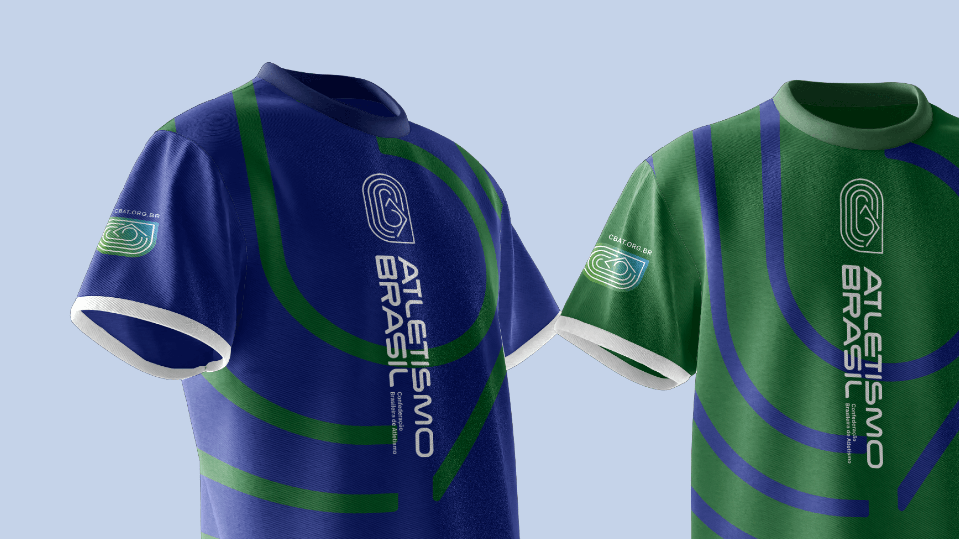
Rebranding. Layout de Site. Design. Criação de uma identidade mais moderna e coesa para a Confederação Brasileira de Atletismo (CBAt). Melhora na aplicação da marca e padronização do formato para eventos realizados no país. Alteração do nome fantasia para aprimorar a representação a nível nacional através da designação da Confederação como autoridade sob o nome "Atletismo Brasil", alinhando-se à tendência global das entidades esportivas, como a transição da antiga IAAF para World Athletics e da CONSUDATLE para Atletismo Sudamericano.
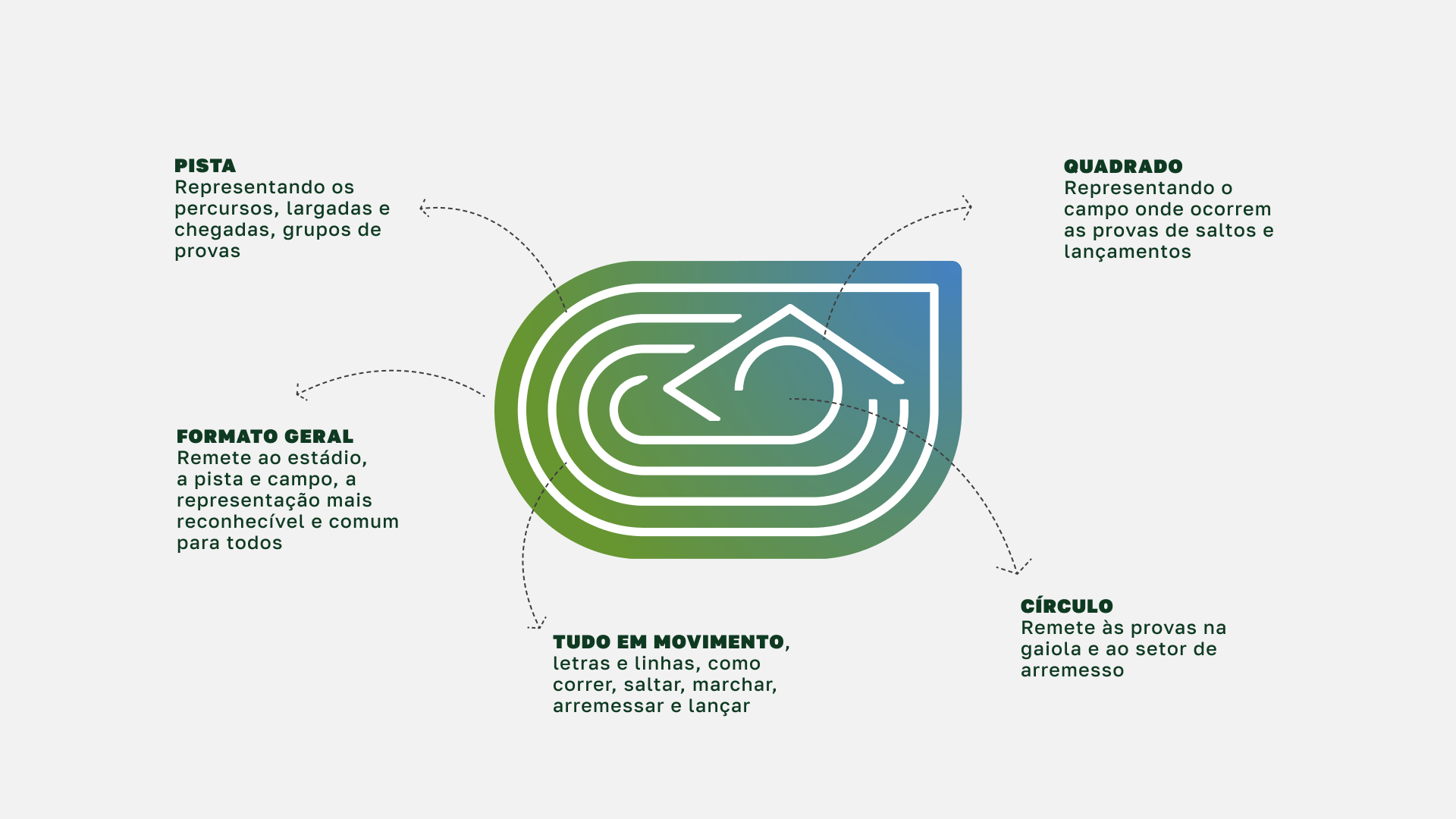
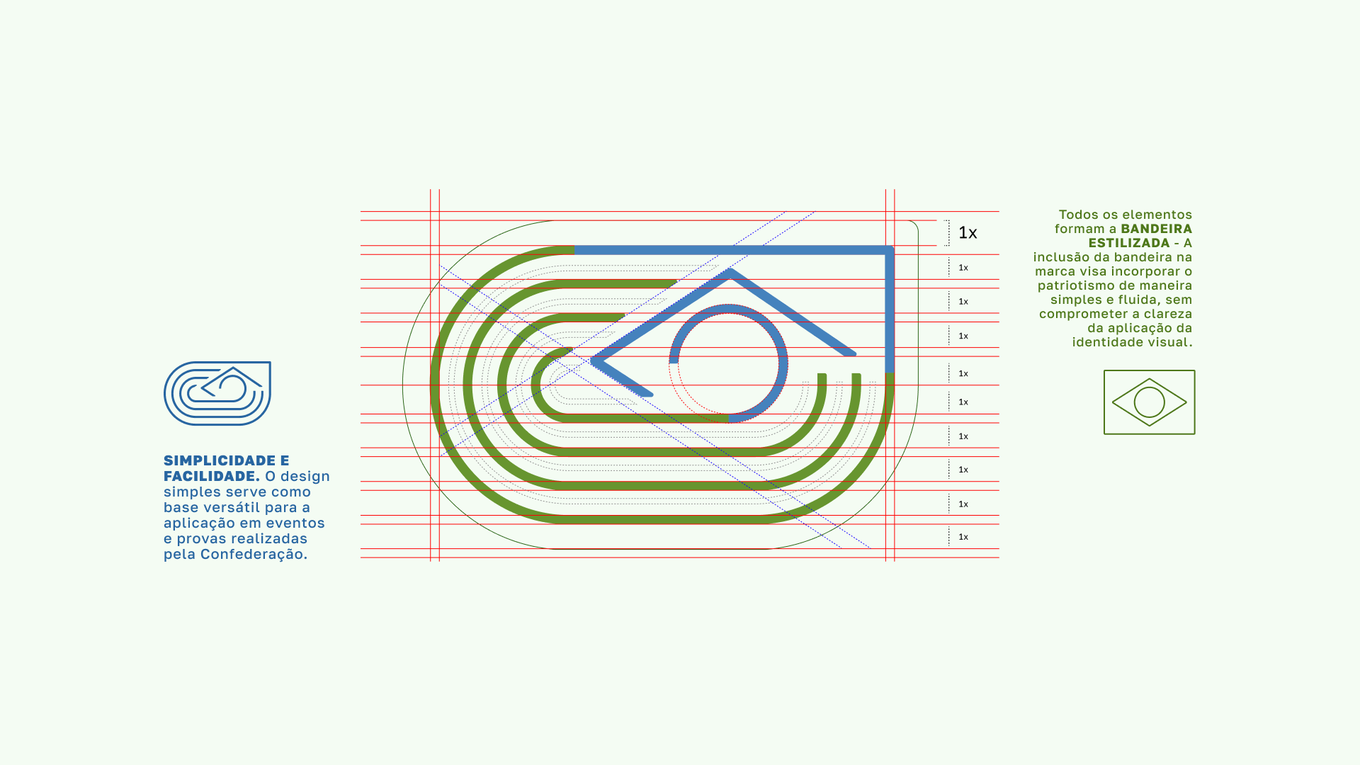
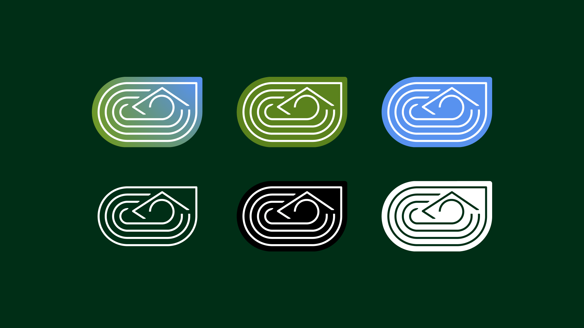
Significados por trás do design: Formato Geral, representando os ginásios onde ocorrem a maior parte das provas de Atletismo, as faixas simbolizam as provas de velocidade, meio-fundo, fundo, marca, barreiras, obstáculos, revezamentos, além dos pórticos de partidas e chegadas das provas de rua. A ponta quadrada reproduz o formato do campo onde ocorrem as provas de saltos e lançamentos, o círculo remete a gaiola das provas de arremessos, e a união dos elementos geométricos formam a bandeira do Brasil, incorporando o patriotismo de maneira simples e fluida, sem comprometer ou poluir a aplicação da marca.
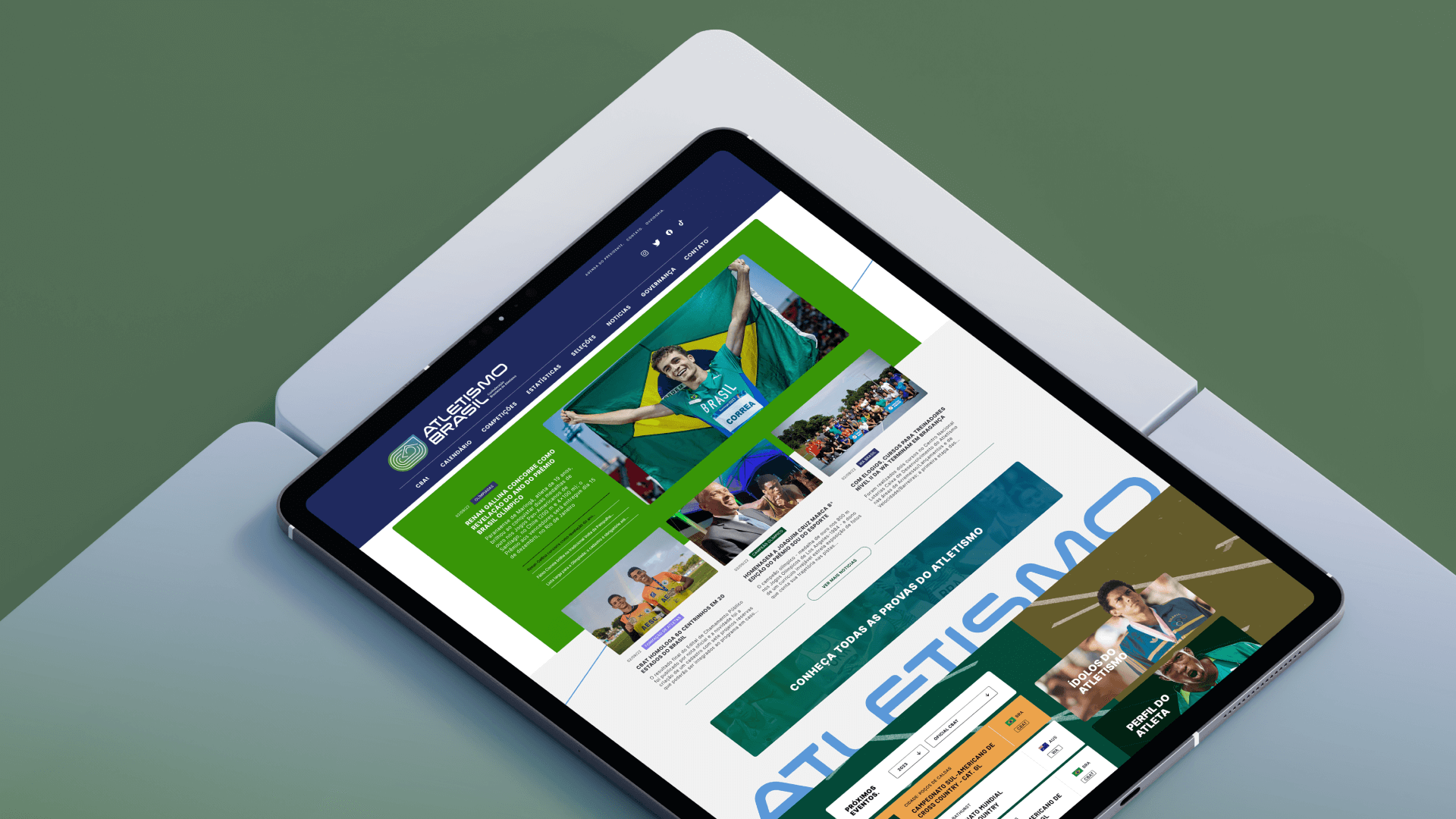
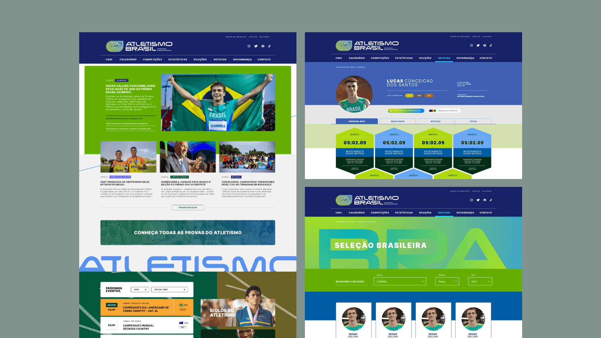
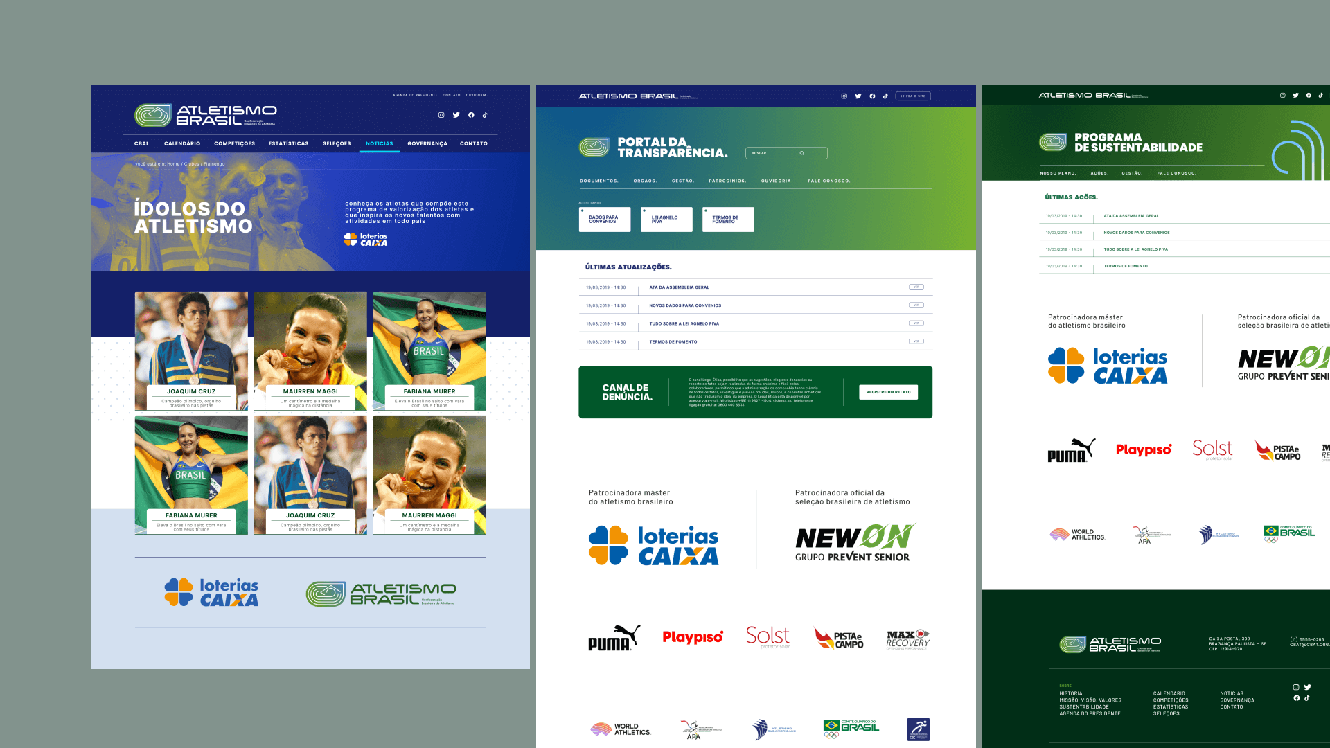
Com a atualização da marca, o layout do site oficial também foi modificado, deixando-o mais intuitivo e dinâmico para o usuário final.
---
Todas as imagens utilizadas foram autorizadas e concedidas pela cbat.org.br
Significados por trás do design: Formato Geral, representando os ginásios onde ocorrem a maior parte das provas de Atletismo, as faixas simbolizam as provas de velocidade, meio-fundo, fundo, marca, barreiras, obstáculos, revezamentos, além dos pórticos de partidas e chegadas das provas de rua. A ponta quadrada reproduz o formato do campo onde ocorrem as provas de saltos e lançamentos, o círculo remete a gaiola das provas de arremessos, e a união dos elementos geométricos formam a bandeira do Brasil, incorporando o patriotismo de maneira simples e fluida, sem comprometer ou poluir a aplicação da marca.
Com a atualização da marca, o layout do site oficial também foi modificado, deixando-o mais intuitivo e dinâmico para o usuário final.
---
Todas as imagens utilizadas foram autorizadas e concedidas pela cbat.org.br
Rebranding. Website layout. Design of a more modern and cohesive identity for the Brazilian Athletics Confederation (CBAt). Improved branding and standardized format for events held in the country. Changed the trade name to enhance national representation by designating the Confederation as an authority under the name "Atletismo Brasil," aligning with global trends among sports entities, such as the transition from the former IAAF to World Athletics and from CONSUDATLE to South American Athletics.
Meanings behind the design: General format, representing the arenas where most athletics events take place. The banners symbolize the sprint, middle distance, long distance, hurdles, relays, and the start and finish lines for road events. The square tip reproduces the shape of the field where the jumping and throwing events take place, the circle evokes the cage used in throwing events, and the combination of geometric elements forms the Brazilian flag, embodying patriotism in a simple and fluid way, without compromising or cluttering the brand's application.
With the brand update, the official website's layout was also modified, making it more intuitive and dynamic for the user.
---
All images used were authorized and licensed by cbat.org.br